MindfulSpace
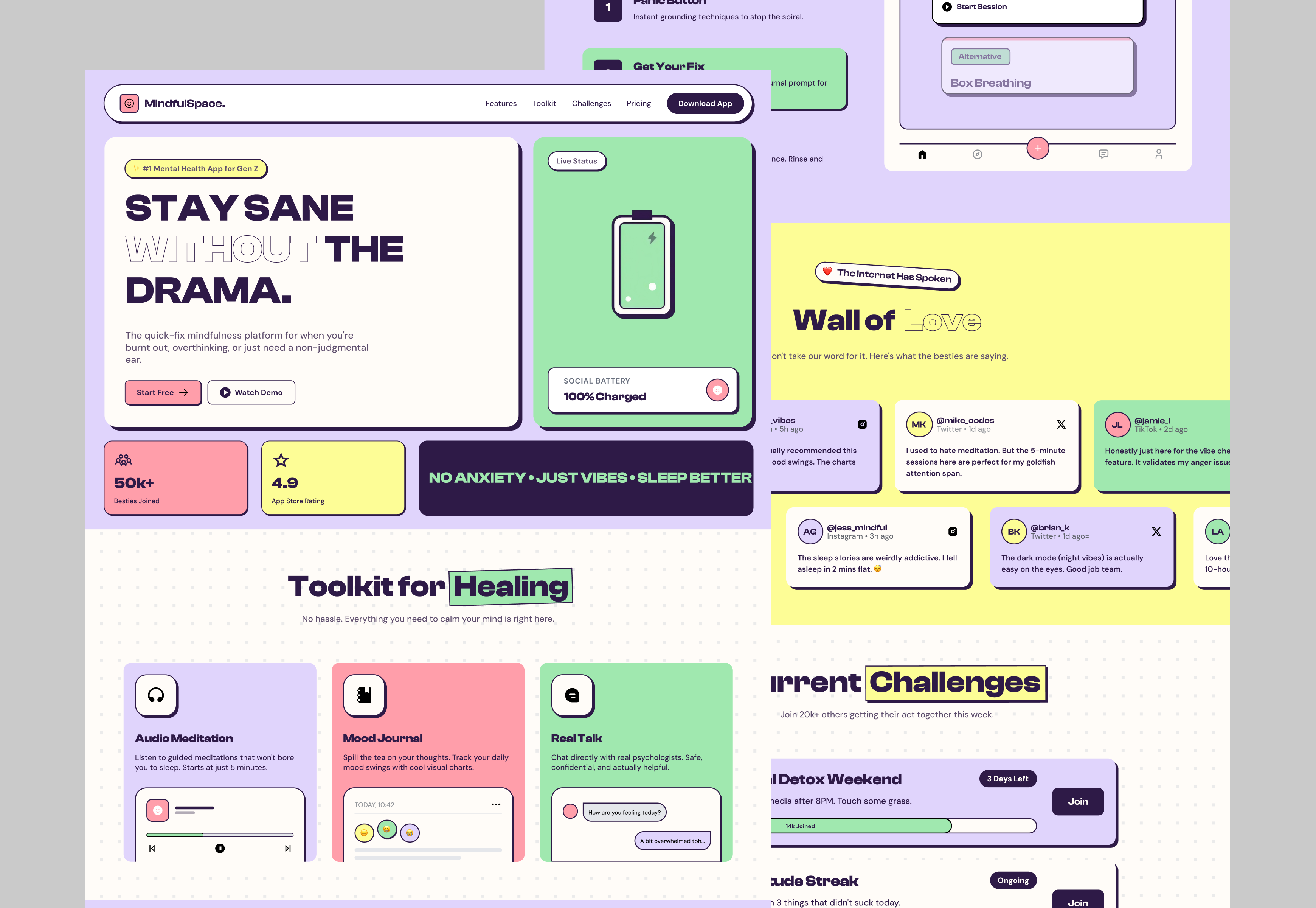
A landing page for a mindfulness product, designed to explain the toolkit quickly, reduce uncertainty, and give visitors a clear path to start.
The context
Mindfulness products often ask users to understand broad ideas before they see what the product does. MindfulSpace needed a clearer entry point, especially for people who want practical support without reading long explanations.
The page needed to answer three questions early, what the product is, how the toolkit helps, and what action the visitor should take next.

The thinking behind the work
I planned the page as a clear scroll story. The hero introduces the main promise and primary actions. The next sections show the toolkit through product UI rather than long feature copy.
The flow then moves through Mood Journal, Emergency Mode, burnout steps, community proof, challenges, pricing, team information, FAQ, and a final CTA. Card based layouts and app framing keep the product visible while each section explains one idea at a time.
Trust and decision support appear later through social style testimonials, simple pricing, and FAQ content so the visitor reaches the final action with fewer unanswered questions.


From direction to delivery
My role covered page structure, product presentation, UI design, and responsive landing page planning. The final page turns a broad wellness offer into a more direct product story with repeated paths to start.
Reusable card patterns and consistent spacing keep the long page visually connected from hero to final CTA.


